End-to-end use cases
Use case: SAP HANA to BI reporting
This page follows one named person, step by step, as she builds a real pipeline in DataFlow AI — from an empty canvas to a finished daily report that business analysts open in their dashboard tool every morning. It is written for readers who have never built an ETL pipeline before, so every term is explained in plain words as it appears.

Meet the people in this story
Before we touch a single screen, it helps to know who is involved. Real ETL work is rarely done by one person alone — it is a small relay race.
| Person | Role | What they need |
|---|---|---|
| Anna Kowalska | Data Engineer | Build the pipeline that moves and reshapes the data |
| Marek Nowicki | Business Analyst | Open the finished report every morning and read it |
| Tomasz Wiśniewski | Data Steward | Make sure no personal data leaks and the numbers are trustworthy |
| Katarzyna Zielińska | Platform Admin | Set up the connections to the source and target systems |
The story is told mostly from Anna's point of view, because she does the building. But you will see exactly where the other three step in.
The business need, in one sentence
Every morning at 08:00, Marek needs a fresh report showing yesterday's sales figures by region and product category — and that data lives inside SAP HANA, a system Marek cannot query himself.
Let us unpack that sentence, because it contains the whole problem.
- SAP HANA is a large, fast database that the Sales Office (
BIURO_SPRZEDAZY) at Polkomtel uses to record every sale. It is powerful, but it is not a friendly place for an analyst to poke around — it speaks a technical "language", it is protected, and running heavy queries on it could slow down the live sales system. - A BI tool (Business Intelligence tool) is the dashboard software Marek already uses — think of it as a screen full of charts and tables he refreshes with a click. BI tools are happiest reading from a data warehouse: a database built specifically for analysis and reporting, kept separate from the live operational systems.
- So the gap is: the data is born in SAP HANA, but it needs to live in a warehouse for Marek to use it. Something has to copy it across every night, clean it up, and summarise it.
That "something" is the pipeline Anna is about to build.
In plain terms
A pipeline is a recipe. It says: take these ingredients from this cupboard, prepare them this way, and put the finished dish on that shelf — and do it again automatically every night. Anna writes the recipe once; DataFlow AI cooks it every day without anyone watching.
The shape of the pipeline before we start
It is worth picturing the finished pipeline before building it, the way you would glance at a recipe photo before cooking. Anna's pipeline will have seven stages, and they map exactly onto the classic Extract, Transform, Load idea:
   SAP HANA            DataFlow AI Design Studio                  Warehouse
 +-----------+   E   +------------------------------------+   L   +-----------+
 | SALES     |------>| Filter -> Join -> Aggregate ->     |------>| DAILY_    |
 | tables    |       | Quality checks                     |       | SALES_RPT |
 +-----------+       +------------------------------------+       +-----------+
       Extract                  Transform                            Load
- Extract — copy yesterday's rows out of SAP HANA.
- Transform — drop test rows, join the sales table to the region/product reference tables, and summarise into per-region, per-category totals.
- Load — write the finished summary into a warehouse table the BI tool reads.
Around those three steps sit three more concerns: data quality (are the numbers trustworthy?), scheduling (run it every night automatically), and publishing (make the result visible to the BI tool). We will cover all of them.
Step 1 — Make sure the connections exist
A connection in DataFlow AI is a saved, named, secured doorway to an outside system. It stores the address, the login, and the security settings for one database — so that pipeline builders never have to type passwords or remember server names.
Anna does not create connections herself. For security reasons, connections are set up once by a Platform Admin — Katarzyna — and the passwords are stored encrypted in Google Secret Manager, never shown on screen again.
So before Anna starts, she checks with Katarzyna that two connections are ready in the workspace:
- A SAP HANA connection — the source. The DataFlow AI connector for SAP HANA is called
sap-hana. It reaches SAP HANA over a driver called ODBC and can read SAP's special analytical views from the_SYS_BICschema (those are pre-built calculations SAP HANA exposes). It has been tested against Polkomtel's realBIURO_SPRZEDAZYviews. - A **warehouse connection** — the target. Polkomtel uses three warehouses depending on the team: **Teradata** (the long-standing
DWH-MONAwarehouse), **Snowflake**, and **BigQuery**. For this report Anna will load into the warehouse her analytics team uses. The walkthrough below uses **Snowflake** as the example, and alater shows what changes for Teradata or BigQuery. - In the left sidebar, Admin → Connections → "+ New Connection".
- Choose the connector type from the grid — for the source, the SAP HANA tile.
- Fill the form: hostname, port (SAP HANA uses port
30015for a tenant database), database name, username, and password. Authentication is set toPASSWORD. - Click "Test Connection". DataFlow AI makes a live connection and shows the round-trip latency plus a small preview of the schema. A green result means the doorway works.
- Click "Save". The connection now appears in the Design Studio toolbox for any engineer in the workspace.
- Left sidebar → Pipelines → "+ New Pipeline" (the keyboard shortcut
Alt+Ndoes the same thing from anywhere). - She types a name:
daily_sap_sales_report. Names matter — they show up in monitoring screens and Git history, so she keeps it descriptive. - She adds a short description: "Daily SAP HANA sales summary by region and product category for BI."
- For mode, she chooses Batch. Batch means the pipeline runs on a schedule, processes one big load of data, and stops — which is exactly right for a once-a-night report. (The other mode, Streaming, runs continuously 24/7 and is used for real-time work; it is not what we want here.)
- She clicks "Create". The canvas opens.
- Connection — she picks the
sap-hanaconnection Katarzyna prepared. - Table or Query — she could pick a single table from the schema browser, but this report needs rows from one main fact table, so she writes a small query. A query is a typed instruction telling the database exactly which rows to return.
- Incremental column — this is the clever part. Anna does not want to copy all sales history every single night; that would be slow and pointless. She wants only yesterday's rows. She sets the incremental column to the sale date and uses a date filter so each run pulls one day.
- The first Join matches the filtered sales rows to the region table on
region_id, adding aregion_namecolumn. - The second Join matches that result to the product table on
product_id, addingproduct_category. - Group by:
region_name,product_category - Aggregations:
total_revenue= SUM ofnet_amountunits_sold= SUM ofquantitytransaction_count= COUNT ofsale_id
- Connection — the Snowflake warehouse connection.
- Table —
ANALYTICS.REPORTING.DAILY_SALES_RPT, the warehouse table the BI tool will read. - Write mode — this decides how new data meets old data. The options are:
- In the BI tool, Marek (or a BI administrator) creates a data source pointing at the Snowflake warehouse.
- He selects the
DAILY_SALES_RPTtable — a small, clean, pre-summarised table. Because the pipeline already filtered, joined, and aggregated the data, the BI tool only has to display it. No heavy lifting happens at dashboard-open time. - He builds the charts once: revenue by region, units by product category, a transaction-count trend.
- He sets the dashboard to refresh each morning after 05:30.
How a connection gets created (Katarzyna's side)
So you can see what Anna is relying on, here is the click-path Katarzyna followed earlier:
Watch out
Creating or editing a connection requires at least the Data Engineer role, and the underlying credentials are never displayed again after saving. If a "Test Connection" fails, it is almost always a network or firewall issue between the platform and SAP HANA — not something Anna can fix from the pipeline screen. She raises it with Katarzyna.
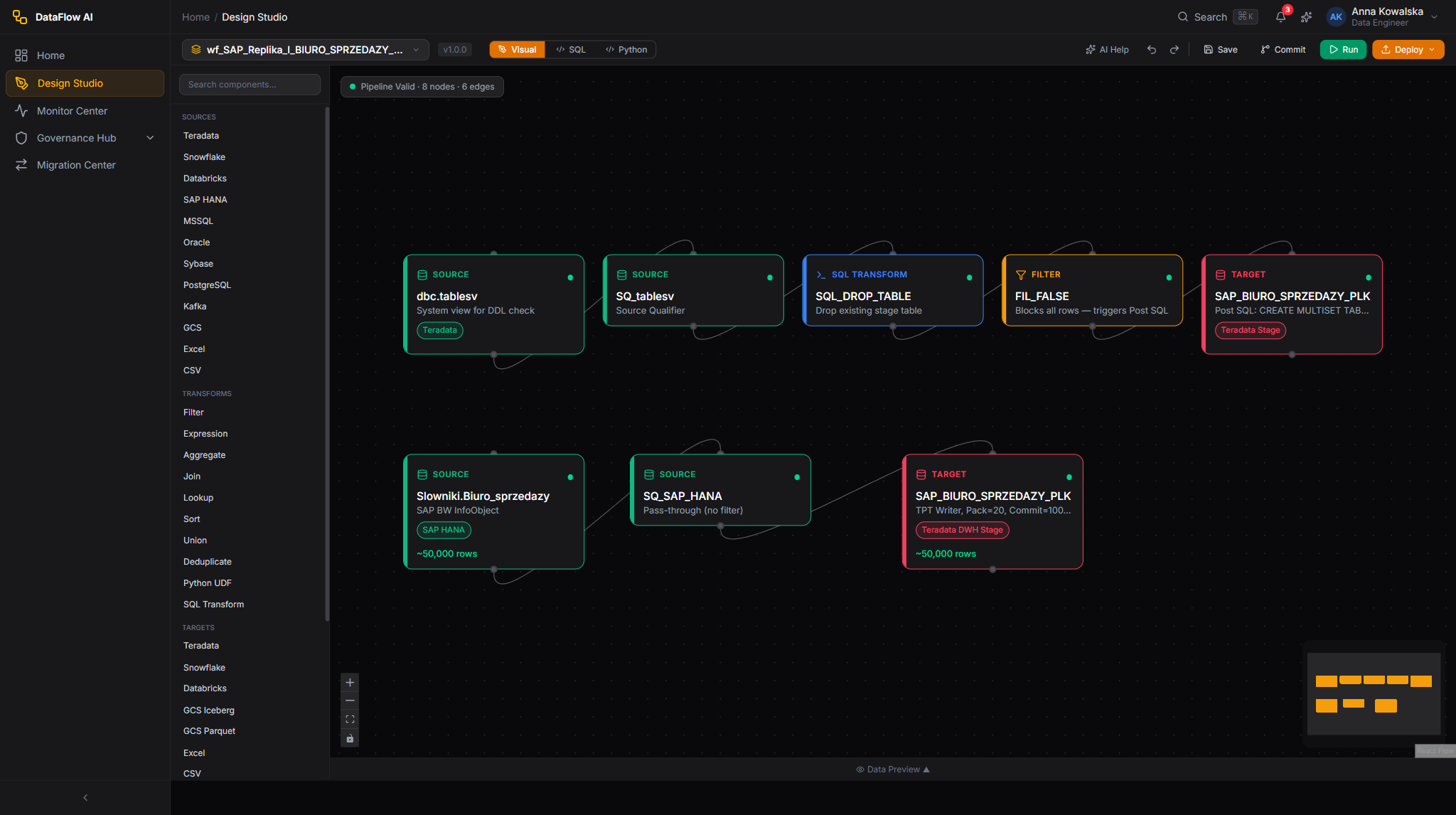
Step 2 — Create the pipeline and open Design Studio
Design Studio is the visual workshop where pipelines are built. It is a drag-and-drop canvas: you place "nodes" (boxes that each do one job) and connect them with lines that carry data from box to box.
Anna creates the pipeline:
In plain terms
Batch vs. Streaming is just two speeds of ETL. Batch is the milkman: one delivery, same time every day. Streaming is the tap: water flows the instant you turn it on and never stops. A morning sales report is a milkman job.
The Design Studio screen
The canvas has four main areas. Anna will use all of them:
| Area | Where | What it is for |
|---|---|---|
| Component Palette | Left | The toolbox of node types, grouped into Sources, Transforms, Targets, Quality, and AI. Searchable with Ctrl+K. |
| Canvas | Centre | The work surface where nodes are placed and wired. |
| Properties Inspector | Right | The settings panel for whichever node is currently selected. |
| Bottom Panel | Bottom | Data Preview, Console (logs), and Test Results. Toggle it with Ctrl+J. |
The Studio auto-saves every 30 seconds, so Anna never loses work.
Step 3 — Extract: read the sales data out of SAP HANA
The first node every pipeline needs is a Source — the box that copies data out of a system.
Anna drags the SAP HANA tile from the Sources group of the palette onto the canvas. A blue source node appears. She clicks it, and the Properties Inspector on the right fills with settings.
She configures three things in the General tab:
Her source query looks like this:
SELECT
  sale_id,
  sale_date,
  region_id,
  product_id,
  channel_code,
  net_amount,
  quantity
FROM "_SYS_BIC"."biuro.sprzedazy/SALES_FACT"
WHERE sale_date = '{{yesterday}}'
The {{yesterday}} part is a template function — a placeholder DataFlow AI fills in automatically when the pipeline runs. On the morning of 21 May it becomes 2026-05-20; the next day it becomes 2026-05-21. Anna writes the recipe once and it always asks for "yesterday", whatever today happens to be.
In plain terms
An incremental load is the difference between re-reading an entire book every night and reading only the page that was added today. The book (all of sales history) might be huge; yesterday's page is tiny. Incremental loads keep the pipeline fast and keep the load on SAP HANA gentle.
Before moving on, Anna clicks Preview on the source node. The bottom panel shows up to 100 sample rows fetched live from SAP HANA. She can see real sale records — proof that the doorway works and the columns are named as she expects.
Step 4 — Transform: filter, join, and aggregate
Raw data is almost never report-ready. Anna now adds three transform nodes in a row. Each does one job.
4a. Filter — drop the test rows
The Sales Office sometimes records dummy sales for system testing, flagged with a channel code of TEST. Those must never reach a business report.
Anna drags a Filter node onto the canvas and wires the source node's output into it. (She wires nodes by hovering over the source node until a small circle — an output port — appears on its edge, then dragging a line from that circle to the next node's input port.)
In the Filter node she sets a condition:
channel_code != 'TEST'
Any row where the channel code is TEST is dropped; everything else passes through.
4b. Join — bring in human-readable names
The sales table stores a region_id and a product_id — numbers, not names. Marek's report needs to say "Mazovia" and "Mobile Plans", not "7" and "412". The friendly names live in two small reference tables.
A Join node combines two datasets by matching a shared column — like laying two lists side by side and lining up the rows that share an ID.
Anna adds two more SAP HANA source nodes (one reading the region reference table, one the product reference table), then drags two Join nodes:
She uses a LEFT join for both. A LEFT join keeps every sales row even if a matching reference row is somehow missing — so a sale is never silently lost just because a region code was not yet in the reference table.
4c. Aggregate — summarise into the report shape
Marek does not want one row per individual sale — he wants totals. An Aggregator node does this: it groups rows together and calculates a summary number for each group, exactly like a spreadsheet pivot table.
Anna drags an Aggregator node and configures it:
After this node, a day with 90,000 individual sales might collapse to just 60 summary rows — one per region-and-category combination. That is the report.
In plain terms
Think of the three transforms as three kitchen actions. Filter throws out the spoiled ingredients. Join brings the labelled jars next to the unlabelled ones so you know what is what. Aggregate is the final plating — turning a pile of ingredients into a small number of finished portions.
Doing it in SQL instead — the same pipeline, two views
Everything above was built by dragging boxes. But Design Studio has a SQL mode: a button at the top switches the canvas to a code editor showing the same pipeline as SQL. Some engineers prefer to express joins and aggregations as a single SQL statement. Anna glances at the SQL view to double-check the logic:
SELECT
  r.region_name,
  p.product_category,
  SUM(s.net_amount)  AS total_revenue,
  SUM(s.quantity)    AS units_sold,
  COUNT(s.sale_id)   AS transaction_count
FROM sales_fact s
LEFT JOIN dim_region  r ON s.region_id  = r.region_id
LEFT JOIN dim_product p ON s.product_id = p.product_id
WHERE s.channel_code != 'TEST'
GROUP BY r.region_name, p.product_category
The visual canvas and the SQL editor are two windows onto one pipeline definition — change either and the other updates. Anna can work whichever way suits the task.
In plain terms
DataFlow AI has a Push-Down SQL Engine. When the source and target can speak SQL, the platform is smart enough to send the instruction to the database rather than dragging all the data across the network to process it here. SAP HANA has a fast in-memory engine; letting it do the filtering and grouping in place is quicker and cheaper. The platform claims it can push down around 90% of standard analytical work this way — and Anna does not have to do anything special to get it.
Step 5 — Data quality: make the numbers trustworthy
A beautiful report built on bad data is worse than no report. Before the data is allowed to land in the warehouse, Anna adds Quality nodes — automatic checks that inspect the data and can stop the pipeline if something looks wrong.
DataFlow AI offers ten kinds of quality rule. Anna picks four that matter for this report:
| Quality check | Rule type | What it catches |
|---|---|---|
| Region name is always present | NOT_NULL | A join that failed to find a region |
| Revenue is never negative | RANGE (min 0) | A data-entry error or a refund recorded wrongly |
| The summary has a sensible number of rows | ROW_COUNT | An empty or doubled load |
| Yesterday's data is actually fresh | FRESHNESS | The source did not update overnight |
She drags a Quality node onto the canvas after the Aggregator and configures these rules in its settings. For each rule she sets a severity — Critical, Warning, or Info — and whether a failure should block the pipeline.
Anna sets the NOT_NULL and RANGE checks to Critical / block: if region names are missing or revenue is negative, the pipeline stops and nothing reaches the warehouse — better no report than a wrong one. She sets the ROW_COUNT check to Warning: it raises an alert but lets the run continue.
Watch out
Quality rules run on every single execution, not just once. This is deliberate. Source systems change without warning — a column gets renamed, a feed arrives late, an upstream bug doubles every row. The quality node is the seatbelt that catches those problems before they become a wrong number on an executive's screen. Tomasz the Data Steward also monitors these scores from the Governance Hub.
Where personal data gets masked
This particular sales report deals with regions and product categories, not customers, so it contains no personal data. But if a pipeline did pull a customer's PESEL (the Polish national ID number) or phone number, Anna would add an Expression node to mask those columns — scrambling or hiding the sensitive part — so the personal detail never reaches the final report. DataFlow AI's PII scanner would also flag such columns automatically for Tomasz to review. Masking happens during the Transform step, on purpose, so sensitive data is dealt with early.
Step 6 — Load: write the result into the warehouse
The final node is a Sink (also called a Target) — the box that writes data into a destination system.
Anna drags the Snowflake tile from the Targets group and wires the Quality node's output into it. In the Properties Inspector she sets:
| Write mode | What it does | Good for |
|---|---|---|
| Append | Adds new rows next to the existing ones | Logs, history that only grows |
| Overwrite | Deletes everything, writes fresh | Small lookup tables |
| Upsert / Merge | Updates rows that already exist, inserts rows that are new | Most daily loads |
| Delete-Insert | Removes one slice of data, then re-inserts it | Re-loading a single day |
Anna picks Delete-Insert, keyed on the report date. Why? Because if yesterday's run is ever re-run (to fix a problem), she wants it to cleanly replace yesterday's slice — not pile a second copy on top. Delete-Insert removes the old day and writes the corrected day.
She clicks Validate in the toolbar. Validation checks that every node is connected, every required field is filled, there are no loops in the DAG, and the schemas line up. A green result means the pipeline is runnable.
Then she clicks Run → Run Now for a first manual test. The nodes light up one by one as data flows through; the Console tab streams logs; a few seconds later the run finishes green. Anna opens the warehouse and sees DAILY_SALES_RPT populated with yesterday's 60 summary rows. The pipeline works.
Step 7 — The pipeline as YAML
Everything Anna built by dragging boxes is stored, behind the scenes, as a single human-readable text file in a format called YAML. Every save is automatically committed to Git, so the pipeline has full version history. Anna can view and edit this YAML directly with the YAML tab — the visual canvas and the YAML stay in sync.
Here is the finished pipeline:
apiVersion: dataflow.polkomtel.com/v1
kind: Pipeline
metadata:
  name: daily-sap-sales-report
  namespace: revenue-assurance
  labels:
    domain: sales
    report: bi-daily
  annotations:
    description: Daily SAP HANA sales summary by region and product category
    owner: anna.kowalska@plk.pl
    sla: "08:00 Europe/Warsaw"
spec:
  schedule: "0 5 * * 1-5 !PL_HOLIDAY"
  timezone: Europe/Warsaw
  enabled: true
  timeout: 1800
  retries: 3
  retryDelay: 300
  parameters:
    - name: report_date
      type: date
      default: "{{yesterday}}"
      description: The sales day to summarise

  nodes:
    - id: src_sales
      type: connector_source
      label: SAP HANA - sales fact
      config:
        connector: sap-hana
        query: >
          SELECT sale_id, sale_date, region_id, product_id,
                 channel_code, net_amount, quantity
          FROM "_SYS_BIC"."biuro.sprzedazy/SALES_FACT"
          WHERE sale_date = '{{parameters.report_date}}'
        incrementalColumn: sale_date
        fetchSize: 5000

    - id: src_region
      type: connector_source
      label: SAP HANA - region reference
      config:
        connector: sap-hana
        table: '"_SYS_BIC"."biuro.sprzedazy/DIM_REGION"'

    - id: src_product
      type: connector_source
      label: SAP HANA - product reference
      config:
        connector: sap-hana
        table: '"_SYS_BIC"."biuro.sprzedazy/DIM_PRODUCT"'

    - id: drop_test_rows
      type: filter
      label: Remove test transactions
      config:
        condition: "channel_code != 'TEST'"

    - id: join_region
      type: joiner
      label: Add region name
      config:
        leftInput: drop_test_rows
        rightInput: src_region
        joinType: LEFT
        on: "region_id"

    - id: join_product
      type: joiner
      label: Add product category
      config:
        leftInput: join_region
        rightInput: src_product
        joinType: LEFT
        on: "product_id"

    - id: summarise
      type: aggregator
      label: Totals by region and category
      config:
        groupBy: [region_name, product_category]
        aggregations:
          - { column: net_amount, function: SUM,   alias: total_revenue }
          - { column: quantity,   function: SUM,   alias: units_sold }
          - { column: sale_id,    function: COUNT, alias: transaction_count }

    - id: quality_gate
      type: quality
      label: Trust checks
      config:
        rules:
          - { type: NOT_NULL, column: region_name, severity: CRITICAL, blockPipeline: true }
          - { type: RANGE,    column: total_revenue, min: 0, severity: CRITICAL, blockPipeline: true }
          - { type: ROW_COUNT, min: 1, severity: WARNING, blockPipeline: false }

    - id: load_warehouse
      type: connector_sink
      label: Snowflake - DAILY_SALES_RPT
      config:
        connector: snowflake
        table: ANALYTICS.REPORTING.DAILY_SALES_RPT
        writeMode: DELETE_INSERT
        upsertKeys: [report_date, region_name, product_category]
        batchSize: 10000

  edges:
    - { from: src_sales,      to: drop_test_rows }
    - { from: drop_test_rows, to: join_region }
    - { from: src_region,     to: join_region }
    - { from: join_region,    to: join_product }
    - { from: src_product,    to: join_product }
    - { from: join_product,   to: summarise }
    - { from: summarise,      to: quality_gate }
    - { from: quality_gate,   to: load_warehouse }

  notifications:
    onSuccess:
      - channel: email
        message: "Daily SAP sales report loaded for {{parameters.report_date}}"
    onFailure:
      - channel: slack
        message: "FAILED: daily SAP sales report for {{parameters.report_date}}"
You do not need to memorise this — Design Studio writes it for you. But it is worth knowing it exists, because it makes the pipeline reviewable, diff-able, and recoverable like any other piece of code.
Step 8 — Schedule the daily run
A pipeline that has to be started by hand every morning is not much of an automation. Anna sets a schedule so DataFlow AI runs it on its own.
In Pipeline Settings (the gear icon) she sets the schedule. You can build it with a visual picker or type a cron expression — a compact code that means "run at these times". Anna uses:
0 5 * * 1-5 !PL_HOLIDAY
Reading that left to right: minute 0, hour 5, every day-of-month, every month, days 1-5 (Monday to Friday). So: 05:00 every weekday. That gives the pipeline three hours of headroom before Marek's 08:00 deadline.
The !PL_HOLIDAY part is a DataFlow AI extension. It means: skip Polish public holidays. The platform has the Polish holiday calendar built in (New Year, Three Kings, Easter Monday, Constitution Day, and the rest), so the report does not run pointlessly on a day the Sales Office is closed.
In plain terms
A cron expression is just a five-slot time pattern: minute, hour, day-of-month, month, day-of-week. It looks cryptic but it is only ever answering one question — "when should this run?". 0 5 * * 1-5 means five o'clock in the morning, Monday to Friday.
If anything goes wrong overnight, the pipeline retries up to three times with increasing delays, and the onFailure notification sends a Slack message — so Anna learns about a problem before Marek does.
Step 9 — Expose the result to the BI tool
The pipeline now drops a clean, trustworthy summary into ANALYTICS.REPORTING.DAILY_SALES_RPT in the warehouse every weekday morning. The last mile is connecting Marek's dashboard to it.
This part happens in the BI tool, not in DataFlow AI — but it is simple, because the hard work is done:
From then on, Marek opens his dashboard at 08:00 and sees yesterday's figures — fresh, correct, and fast — without ever touching SAP HANA.
In plain terms
The reason the BI tool feels instant is that the pipeline pushed all the slow work to the night before. Marek's dashboard reads a tiny finished table, not millions of raw sales rows. Good ETL design is mostly about doing the expensive work once, in advance, where nobody is waiting.
Switching the target warehouse
The walkthrough used Snowflake, but Polkomtel runs three warehouses. Swapping the target is a small change — only the Sink node differs.
| Warehouse | Connector | Notable detail |
|---|---|---|
| Snowflake | snowflake | Bulk load via COPY INTO; supports MERGE for upserts |
Teradata (DWH-MONA) | teradata | Uses the high-speed Teradata Parallel Transporter; pick multiload mode for upserts |
| BigQuery | bigquery | Loads via batch load jobs; data stays in the customer's own GCP project in Warsaw |
To switch, Anna deletes the Snowflake sink, drags the new warehouse's tile in its place, points it at the right connection and table, and re-validates. The seven-stage shape of the pipeline — extract, filter, join, aggregate, quality, load — does not change at all.
What Anna built, summarised
| Stage | Node type | Purpose |
|---|---|---|
| 1 | connector_source (sap-hana) | Extract yesterday's sales from SAP HANA |
| 2 | filter | Drop test transactions |
| 3 | joiner ×2 | Add region names and product categories |
| 4 | aggregator | Summarise into per-region, per-category totals |
| 5 | quality | Block the run if the numbers look wrong |
| 6 | connector_sink (warehouse) | Load the summary into the warehouse |
| 7 | schedule + notifications | Run every weekday at 05:00, alert on failure |
One recipe, written once by Anna, now feeds Marek's morning dashboard every working day — and Tomasz can see, at any time, that the data is masked where it needs to be and the quality checks are passing. That is a complete ETL use case, end to end.