Feature guides
Monitor Center
The Monitor Center is the operational control hub of the DataFlow AI Platform. It gives every role real-time and historical visibility into pipeline execution across Polkomtel's 500+ pipelines, with AI-assisted failure diagnosis built directly into the run-detail view.
New here? What "monitoring" means
Once a pipeline is built and scheduled, it runs on its own — often in the middle of the night. Monitoring is how you check that those automatic runs actually worked, and how you find out why when one didn't. The Monitor Center is the screen you open every morning to answer three questions:
- Did everything run last night?
- If something failed, what failed and why?
- Is anything running slower, or costing more, than it should?
A few words you will see everywhere on this screen:
- Run — one single execution of a pipeline. Each run has its own ID, a start and end time, a status, and its own logs. The same pipeline produces a new run every time it fires.
- Status — the outcome of a run. Success (green) means it finished correctly; Failed (red) means it stopped with an error; Running (blue, pulsing) means it is still going; Warning (yellow) means it finished but something looked off; Cancelled means a person or a timeout stopped it.
- SLA — Service Level Agreement, the promise about how a pipeline should behave (for example "finishes within 30 minutes" or "succeeds 99% of the time"). The Monitor Center warns you when a pipeline is at risk of breaking that promise.
- Logs — the detailed line-by-line diary a run writes as it works. When something fails, the logs hold the exact error.
You don't have to be technical to use this page
The Monitor Center is built so that anyone can read it. Color tells the story — green is fine, red needs attention. And when a run fails, the AI Diagnosis panel explains the cause in plain English and suggests a fix, so you do not have to decode a stack trace yourself.
What the Monitor Center does
Polkomtel runs a mix of batch workloads (nightly, hourly, every-2-hours) and near-real-time CDC/Kafka streams targeting Teradata DWH-MONA, Snowflake, Databricks, and GCS/Iceberg. The Monitor Center exists to surface failures fast, support AI-assisted diagnosis, and make hundreds of concurrent runs scannable.
Its design principles:
- Glanceability — critical status is visible within two seconds of page load.
- Drill-down — every summary element is clickable and leads to detail.
- AI-first debugging — the AI Diagnosis panel is prominent, not hidden.
- Dense but scannable — data grids and Gantt charts for power users; KPI cards for managers.
Route base: /monitor (redirects to /monitor/runs). Entry file: src/pages/MonitorCenter.tsx, layout pages/monitor/MonitorCenterLayout.tsx.
Who uses it
All roles use the Monitor Center; it is the primary working surface for the Data Engineer (Anna) and the Platform Admin (Katarzyna).
Navigation — the sub-pages
The Monitor Center is a nested module. Its layout renders a tab bar with badge counts, and the sidebar links to roughly eleven sub-pages.
Monitor Center
 [Pipeline Runs (3 running)]  [Performance]  [Alerts (5 active)]  [Logs (12 errors)]
| Sub-page | Route | Purpose |
|---|---|---|
| Pipeline Runs | /monitor/runs | Live + historical run list with Gantt and grid |
| Run Detail | /monitor/runs/:runId | Single run, DAG view, AI diagnosis |
| Run Log Viewer | /monitor/runs/:runId/logs | Logs scoped to one run |
| Performance Analytics | /monitor/performance | Duration, volume, success-rate, resource charts |
| Alert Management | /monitor/alerts | Alert list with severity and acknowledge actions |
| Global Log Viewer | /monitor/logs | Structured logs across all pipelines |
| Self-Healing | /monitor/self-healing | Self-healing automation dashboard |
| Data Quarantine | /monitor/quarantine | Rows quarantined by quality rules |
| Data Freshness | /monitor/freshness | Per-source freshness monitor |
| SLA Burn Rate | /monitor/sla | SLA burn-rate tracking |
| Pipeline Costs | /monitor/costs | Per-pipeline cost dashboard |
Badge counts: Pipeline Runs shows N running (blue), Alerts shows N active (red if a critical alert exists, otherwise yellow), Logs shows N errors (red when there are unread errors in the last hour).
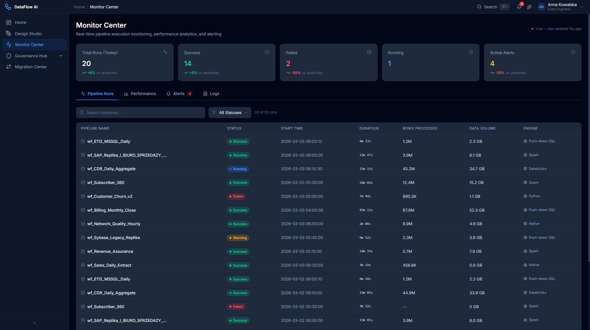
Pipeline Runs Dashboard
The default landing screen — /monitor/runs.
+-----------------------------------------------------------------------+
| KPI STRIP                                                              |
| [Total 487] [Running 3] [Success 461] [Failed 8] [Warning 15]         |
+-----------------------------------------------------------------------+
| FILTERS:  Status [All v]  Time [Last 24h v]  Search [____]  [Refresh] |
+-----------------------------------------------------------------------+
| GANTT CHART (last 24 hours)                                            |
|  wf_E112          ===RED===                                            |
|  wf_SAP_Replika       ====GREEN====                                    |
|  wf_CDR_Daily             ======GREEN======                            |
+-----------------------------------------------------------------------+
| DATA GRID                                                              |
|  Pipeline | Status | Start | Duration | Rows | Volume | Engine | By   |
+-----------------------------------------------------------------------+
KPI strip
Five tiles — Total Runs (24h), Running, Success, Failed, Warning. Each tile is clickable and sets the status filter on both the Gantt chart and the data grid below.
Filters row
| Control | Options |
|---|---|
| Status | All / Running / Success / Failed / Warning / Scheduled |
| Time Range | Last 1h / 6h / 24h / 7d / 30d / Custom |
| Search | Pipeline-name search (debounced 300ms) |
| Refresh | Manual refresh; the view also auto-refreshes every 30s |
Gantt chart
A 24-hour timeline with one row per pipeline. Bars are colored by status (running bars pulse), their width is proportional to duration, and a hover tooltip shows name, status, times, duration, and rows. Clicking a bar opens that run's detail page.
Data grid
| Column | Notes |
|---|---|
| Pipeline Name | Monospace for the wf_ prefix |
| Status | Colored badge |
| Start Time | DD.MM HH:mm (Polish date format) |
| Duration | Xh Ym Zs |
| Rows Processed | Thousands-separated |
| Data Volume | Human-readable (2.4 GB, 156 MB) |
| Engine | Spark / Flink / Native / Push-down |
| Triggered By | Schedule / manual / api / retry |
Default sort is Start Time descending. Clicking a row opens the Run Detail page.
Pipeline Run Detail
The detail view for one run — /monitor/runs/:runId.
+-----------------------------------------------------------------------+
| < Back        wf_E112 - Run run-20260303-001                          |
| [FAILED]  Started 03:12  Ended 03:47  Duration 35m  Engine Push-down   |
+-----------------------------------------------------------------------+
| [Re-run] [Re-run from Checkpoint] [View Logs] [Open in Design Studio]  |
+-----------------------------------------------------------------------+
| +-- VISUAL DAG (60%) --------+  +-- AI DIAGNOSIS (40%) --------------+ |
| | [Sybase] -> [Filter]       |  | Summary: lock timeout at the      | |
| |    |                       |  |  'Enrich with CRM Data' node.     | |
| |    v                       |  | Root Cause: ...                   | |
| | [Enrich CRM] (RED) -> [...] |  | Suggested Actions: 1. 2. 3.       | |
| +----------------------------+  | Confidence: 92%                   | |
|                                 +-----------------------------------+ |
| EXECUTION TIMELINE  (per-node horizontal bars)                         |
| DATA VOLUME BY NODE (rows in / out, bytes)                             |
+-----------------------------------------------------------------------+
Header strip and actions
The header shows the status badge, run ID, start/end/duration, triggered-by, engine, environment, and workspace. The action buttons:
| Button | Behavior |
|---|---|
| Re-run | Re-runs the whole pipeline (always available) |
| Re-run from Checkpoint | Resumes from the last checkpoint — only shown when a checkpoint exists |
| View Logs | Opens the Log Viewer filtered to this run |
| Open in Design Studio | Opens the pipeline editor for fixes |
Visual DAG (left, 60%)
A React Flow graph of the run, with per-node status:
| Node status | Treatment |
|---|---|
| success | Green border + check icon |
| failed | Red 3px border + red glow + an error-message tooltip bubble |
| running | Animated blue border + spinning loader |
| skipped | Dashed grey border |
| pending | Plain grey border |
AI Diagnosis panel (right, 40%)
A violet-gradient card containing a Summary, a Root Cause explanation, a numbered list of Suggested Actions (with code-highlighted items such as READ UNCOMMITTED), a confidence % badge, clickable links to related failures and impacted pipelines, and a feedback link. Below the two panels sit an Execution Timeline (per-node horizontal bar chart) and a Data Volume by Node breakdown.
For a worked example, the wf_E112 failure diagnoses a Sybase ASE lock timeout at the Enrich with CRM Data node — caused by lock contention from a concurrent wf_SAP_Replika batch update — and suggests re-running from checkpoint with READ UNCOMMITTED isolation, rescheduling to avoid the overlap, and a long-term move to the Snowflake replica, at 92% confidence.
The Log Viewer
Clicking View Logs opens the run-scoped Log Viewer at /monitor/runs/:runId/logs. It streams the run's structured log entries with severity, category, and timestamp columns, and supports filtering and full-text search.
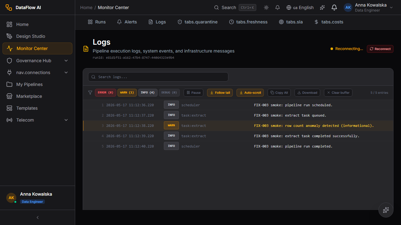
The global Log Viewer at /monitor/logs is the same component without the run scope, surfacing structured logs across all 500+ pipelines.
Performance Analytics
/monitor/performance — a grid of Recharts charts driven by a time-range selector (7d / 30d / 90d / custom).
| Chart | What it shows |
|---|---|
| Pipeline Duration Trends | p50 / p95 / avg duration lines over time |
| Data Volume Trends | Dual-axis area chart of volume (GB) and rows (millions) |
| Success Rate Trend | A line with a red 99% reference target line — dips below it indicate SLA breaches |
| Top 10 Slowest Pipelines | Horizontal bars of average vs. max duration |
| CPU & Memory Utilization | Area charts with amber warning (80%) and red critical (95%) reference lines |
Alerts, Logs, and the operational sub-pages
Beyond runs and performance, the Monitor Center carries a set of operational sub-pages that each answer a specific reliability or cost question.
| Sub-page | What it provides |
|---|---|
| Alert Management | A list of alerts with severity and acknowledge actions |
| Log Viewer | Structured logs filterable by severity, category, and time |
| Self-Healing | A dashboard of automated recovery actions taken on pipelines |
| Data Quarantine | Rows held back by quality rules, pending review |
| Data Freshness | Per-source freshness, showing how stale each dataset is |
| SLA Burn Rate | How fast each pipeline is consuming its SLA error budget |
| Pipeline Costs | Per-pipeline cost attribution and trend |
| Scheduled Reports | Recurring monitoring reports delivered on a schedule |
Data Freshness
The Data Freshness monitor (/monitor/freshness) tracks how stale each source dataset is relative to its expected update cadence. Each source — CRM, Billing, Network, CDR, Product Catalog — shows a freshness bar and a "last updated" timestamp, colored green when fresh, amber when stale, and red when critically overdue.
SLA Burn Rate
The SLA Burn Rate sub-page (/monitor/sla) shows how fast each pipeline is consuming its SLA error budget. A pipeline that fails or runs long burns its budget quickly; the view flags pipelines on track to breach their SLA window — for example a wf_CDR_Daily run that exceeded its 30-minute threshold.
Pipeline Costs
The Pipeline Costs sub-page (/monitor/costs) attributes infrastructure spend to individual pipelines and shows the cost trend over time. It pairs naturally with the Top 10 Slowest Pipelines chart — long-running pipelines are usually the most expensive — and feeds the Admin Console's budget view.
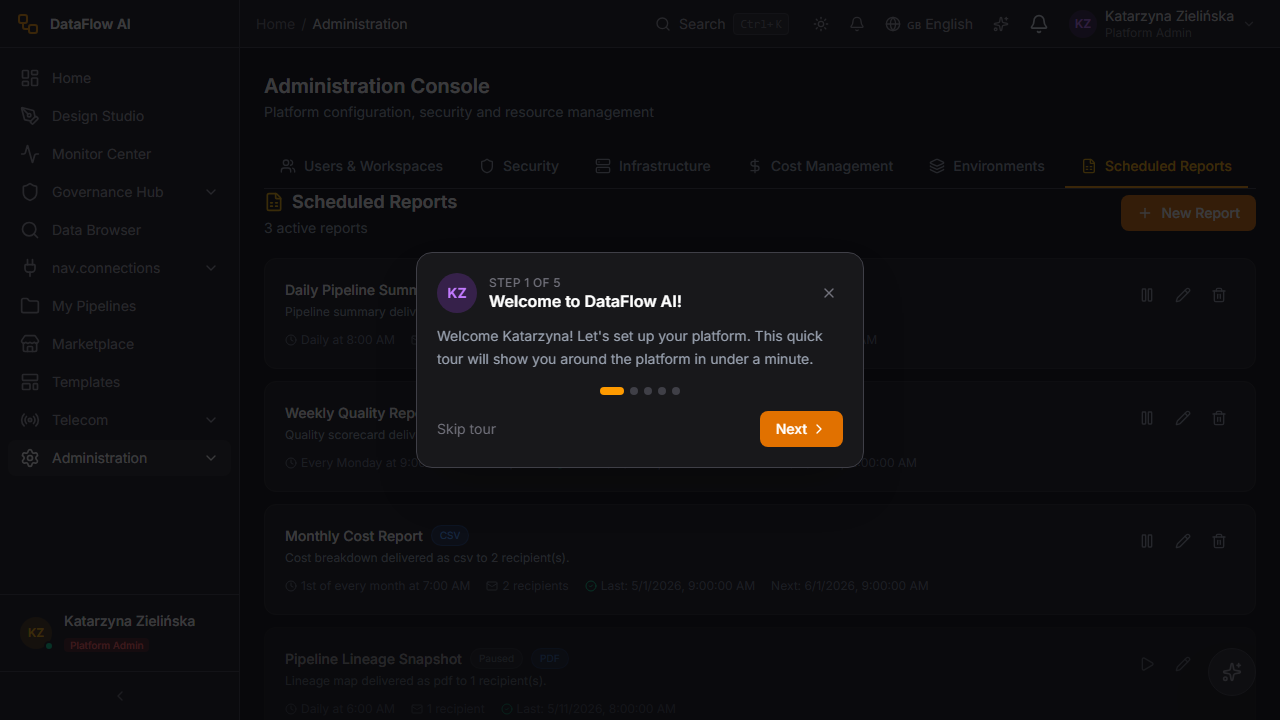
Scheduled Reports
Scheduled Reports let teams receive recurring monitoring summaries — run health, SLA, and cost rollups — on a cadence, delivered automatically rather than pulled by hand.
Cross-reference with the Admin Console
The Monitor Center's Pipeline Costs view is per-pipeline. For platform-wide budgets, forecasts, and anomaly detection, the Admin Console's Cost Management page (/admin/costs) provides the organization-level rollup.
Walkthrough — your morning health check
This is the routine a Data Engineer runs first thing every day. It takes two or three minutes and tells you whether last night's work is safe.
- Open the Monitor Center. Click Monitor in the left sidebar (or press
Alt+M). It opens on the Pipeline Runs dashboard. - Read the KPI strip. Look at the five tiles across the top. If Failed shows
0and Warning is low, last night went well — you are done. If Failed shows a number, continue. - Filter to the failures. Click the red Failed tile. The Gantt chart and the data grid below both instantly filter to show only the runs that failed.
- Pick a failed run. In the grid, click the row of the first failed pipeline (or click its red bar in the Gantt chart). The Run Detail page opens.
- Read the AI Diagnosis. On the right of the Run Detail page, the violet AI Diagnosis panel gives you a plain-language Summary, the Root Cause, and a numbered list of Suggested Actions — plus a confidence percentage so you know how sure the AI is.
- Look at the broken node. On the left, the Visual DAG shows the pipeline as a flowchart. The node with a red glow is where it broke. Hover it to read the exact error in a tooltip bubble.
- Fix it. You have two quick choices: click Re-run from Checkpoint to retry from the last good point (useful when the cause was temporary, like a brief network hiccup), or click Open in Design Studio to correct the pipeline itself.
- Repeat for any remaining failed runs, then clear the Failed filter to return to the full picture.
What is a checkpoint?
A checkpoint is a saved "you-are-here" marker that some pipelines write partway through a run. If a run fails after a checkpoint, Re-run from Checkpoint resumes from that marker instead of starting over — much faster, and it avoids re-processing rows that already succeeded. If a run never reached a checkpoint, that button is hidden and you simply use Re-run.
Click-paths
Investigate a failed run
- Open
/monitor/runs. - Click the Failed KPI tile — this filters both the Gantt chart and the data grid to failed runs.
- In the data grid, click the failed pipeline's row (or its red bar in the Gantt chart).
- The Run Detail page opens. Read the AI Diagnosis panel for the root cause and suggested actions.
- In the Visual DAG, find the node with the red glow and hover it to read the error-message bubble.
- Either click Re-run from Checkpoint to retry from the last good point, or click Open in Design Studio to fix the pipeline.
Configure an alert
- From the Monitor Center tab bar, open Alerts (
/monitor/alerts). - Review the alert list — each row shows a severity and an acknowledge action.
- To handle an active alert, click its Acknowledge action; it is marked acknowledged.
- For deeper triage, follow an alert through to its related run or log view.
Review pipeline cost
- Open the Pipeline Costs sub-page (
/monitor/costs). - Review per-pipeline cost attribution and the cost trend.
- Cross-reference the Top 10 Slowest Pipelines chart in Performance Analytics — long-running pipelines are usually the most expensive.
- For platform-wide budget context, the Admin Console's Cost Management page (
/admin/costs) provides budgets and forecasts.
Check SLA health
- Open Performance Analytics (
/monitor/performance). - Look at the Success Rate Trend chart — any point dipping below the red 99% reference line is an SLA breach.
- Cross-check the Pipeline Duration Trends chart for the same date; a p95 spike usually correlates with an infrastructure incident.
- For burn-rate detail, open the SLA Burn Rate sub-page (
/monitor/sla).
Live updates
The Monitor Center consumes real-time data over Server-Sent Events. Running bars in the Gantt chart and live node statuses on the Run Detail DAG update without a manual refresh; the Pipeline Runs grid also auto-refreshes every 30 seconds.
Re-run from Checkpoint is conditional
The Re-run from Checkpoint button only appears when the failed run actually produced a checkpoint. If it is absent, use Re-run to execute the pipeline from the start, or fix the root cause in Design Studio first.
Common questions
My pipeline is stuck showing "Running" for hours — what now? A run that will not finish is usually one of: a source database that stopped responding, a lock-wait where another process is holding the data, or a stalled service. Open the run, check the Logs for a "Connection timed out" line, and look at the Data Volume by Node panel to see where it froze. Every run has a timeout (default 120 minutes) and auto-cancels when it expires; you can also click Cancel Run to stop it yourself.
What is the difference between a "Failed" run and a "Warning" run? A Failed run hit an error it could not recover from and stopped — its data did not finish loading. A Warning run completed and loaded its data, but something looked unusual (a quality rule flagged some rows, or a step took far longer than normal). Failures need action now; warnings should be reviewed but are not emergencies.
What does the confidence percentage on the AI Diagnosis mean? It is how sure the AI is about its root-cause explanation. A high figure (above ~85%) means the evidence pointed clearly to one cause. A lower figure means the AI found several plausible explanations — read the suggested actions, but verify before applying a fix.
Is "Re-run" safe? Will it duplicate my data? For pipelines whose target uses upsert or merge write mode, re-running is safe — existing rows are updated rather than duplicated. For append-mode targets, a re-run can add rows twice. If unsure, check the pipeline's target write mode in Design Studio first, or prefer Re-run from Checkpoint.
How do I get alerted when something fails, instead of checking every morning? Open the Alerts sub-page and subscribe to a channel — Email, Slack, Teams, a webhook, or PagerDuty. Critical (P1) and high (P2) failures can page on-call staff automatically.
What does "SLA burn rate" mean? Every pipeline has an SLA "error budget" — a small allowance for being late or failing. Each late or failed run spends some of that budget. The SLA Burn Rate page shows how fast each pipeline is using its budget up, so you can act before it runs out and the SLA is formally breached.
Why is one pipeline so expensive? Long-running pipelines burn the most cloud compute. Check the Pipeline Costs sub-page against the Top 10 Slowest Pipelines chart — they usually overlap. The fix is normally in Design Studio: load incrementally, push work down to the database, or split a giant pipeline into smaller ones.
The dashboard is empty — where is my data? Confirm you are in the correct workspace (top-bar selector), widen the Time Range filter, and check that your pipelines have actually run at least once. A hard refresh (Ctrl+Shift+R) clears a stale view.
Behind the scenes
| Concern | API / module |
|---|---|
| Dashboard metrics, alerts, cost | api/monitoring.ts |
| Pipeline runs | api/pipelines.ts |
| Run logs | api/runLogs.ts |
| Root-cause / AI diagnosis | api/rca.ts |
| SLA burn rate | api/slaBurnRate.ts |
| Performance metrics | api/metrics.ts |
Real-time streams are delivered through the platform's SSE manager and consumed by hooks such as useAlertStream, useMetricsStream, and useRealtimePipelineStatus.