Feature guides
Home Dashboard
The Home Dashboard is the screen every user lands on immediately after signing in to the DataFlow AI Platform. It is fully role-adaptive: the layout, widgets, KPI tiles, and quick actions all change depending on which of the four personas is active, so a Data Engineer, Business Analyst, Platform Admin, or Data Steward each gets a surface built for the work they actually do.
New here? What this screen is for
The Home Dashboard is your starting point — the screen that appears the moment you sign in. Its job is to give you a quick, at-a-glance summary of your work before you go anywhere else, so you can see right away whether anything needs attention.
It is role-adaptive, which simply means the dashboard rearranges itself to suit your job:
- A Data Engineer sees pipeline health and recent failures — the things they fix.
- A Business Analyst sees their own pipelines, data freshness, and a box to chat with the AI.
- A Platform Admin sees system health, cost, and active users — the things they run.
- A Data Steward sees data-quality scores and a queue of pipelines waiting for review.
Two terms you will see on this page:
- KPI — a Key Performance Indicator: one important number shown in a small tile (for example "487 / 500 pipelines healthy"). The row of these tiles is the KPI strip.
- Persona — the role the platform thinks you are. It is normally worked out from your login, and it decides which version of the dashboard you see.
Nothing here is permanent — it is a starting point
The dashboard is a launchpad, not a place you do detailed work. Every tile and panel is clickable: you read the summary here, then click through to the Monitor Center, Design Studio, or Governance Hub to actually act.
What the dashboard does
The Home Dashboard answers one question fast: "What needs my attention right now?" It follows a KPI-strip-then-drill pattern — a greeting header, persona-specific quick actions, a strip of 4–6 KPI tiles, and one or two drill-down panels showing recent activity.
Each panel is independently error-isolated: if a single API call fails, that one panel shows a retry control while the rest of the page keeps working. An outer ErrorBoundary is the final safety net so the dashboard never blanks out entirely.
Route: / redirects to /dashboard. Entry file: src/pages/HomeDashboard.tsx.
Who uses it
| Persona | Name | Role | What the dashboard emphasizes |
|---|---|---|---|
engineer | Anna Kowalska | Data Engineer | Pipeline health, recent failures, AI optimization insights |
analyst | Marek Nowicki | Business Analyst | Personal pipelines, AI chat, data freshness, recent extracts |
admin | Katarzyna Zielińska | Platform Admin | System health, cost tracking, active users, infra alerts |
steward | Tomasz Wiśniewski | Data Steward | Review queue, quality scores, lineage entry points |
The active persona is stored in a persisted Zustand personaStore (localStorage key dataflow-persona) and read on every render, so switching persona re-renders the panels in place without re-authentication.
Persona detection
In a real (non-dev) session the persona is derived from your Keycloak roles. In dev mode the platform falls back to whatever persona is selected in personaStore. Either way, the dashboard reads the effective persona and adapts instantly.
The shared shell
Every dashboard variant is rendered inside the same application shell, so navigation is consistent regardless of persona.
+---------------------------------------------------------------------------+
| [=] DataFlow AI                       [?]  [bell (3)]  [Anna Kowalska v]   |  <- TopBar
+--------+------------------------------------------------------------------+
|        |                                                                  |
| SIDE   |   <main id="main-content">                                       |
| BAR    |     ... persona dashboard renders here ...                       |
| (240/  |                                                                  |
|  60px) |                                                          [ * ]  |  <- AI Copilot FAB
+--------+------------------------------------------------------------------+
| Shell element | Behavior |
|---|---|
Hamburger [=] | Collapses/expands the sidebar between 240px and 60px |
| Logo + wordmark | Returns to /dashboard |
Help icon [?] | Opens the Help drawer |
| Notification bell | Red count badge; opens /notifications |
| User menu | Dropdown: Profile, Settings, Logout |
| Left sidebar | Navigation filtered by active persona — items not visible to a role are hidden, not greyed |
| AI Copilot FAB | Sparkle button (bottom-right) opens the AI Copilot side panel on any screen |
The shell also wires Ctrl/Cmd+K to open Global Search.
Anatomy of a persona dashboard
Every variant shares the same four-zone contract, expressed through stable test IDs:
| Zone | Test ID | Purpose |
|---|---|---|
| Greeting header | home-greeting | Persona name, time-of-day greeting, one-line summary, date |
| Quick actions | home-quick-actions | Persona-specific action buttons |
| KPI strip | home-kpi-strip / home-kpi-{slug} | 4–6 metric tiles bound to live API calls |
| Drill-down panels | home-panels-{persona} / home-drill-{slug} | One or two recent-activity / trend panels |
Every KPI tile is bound to a real API call wrapped in the useRetry hook, which retries with exponential backoff plus jitter on transient failures.
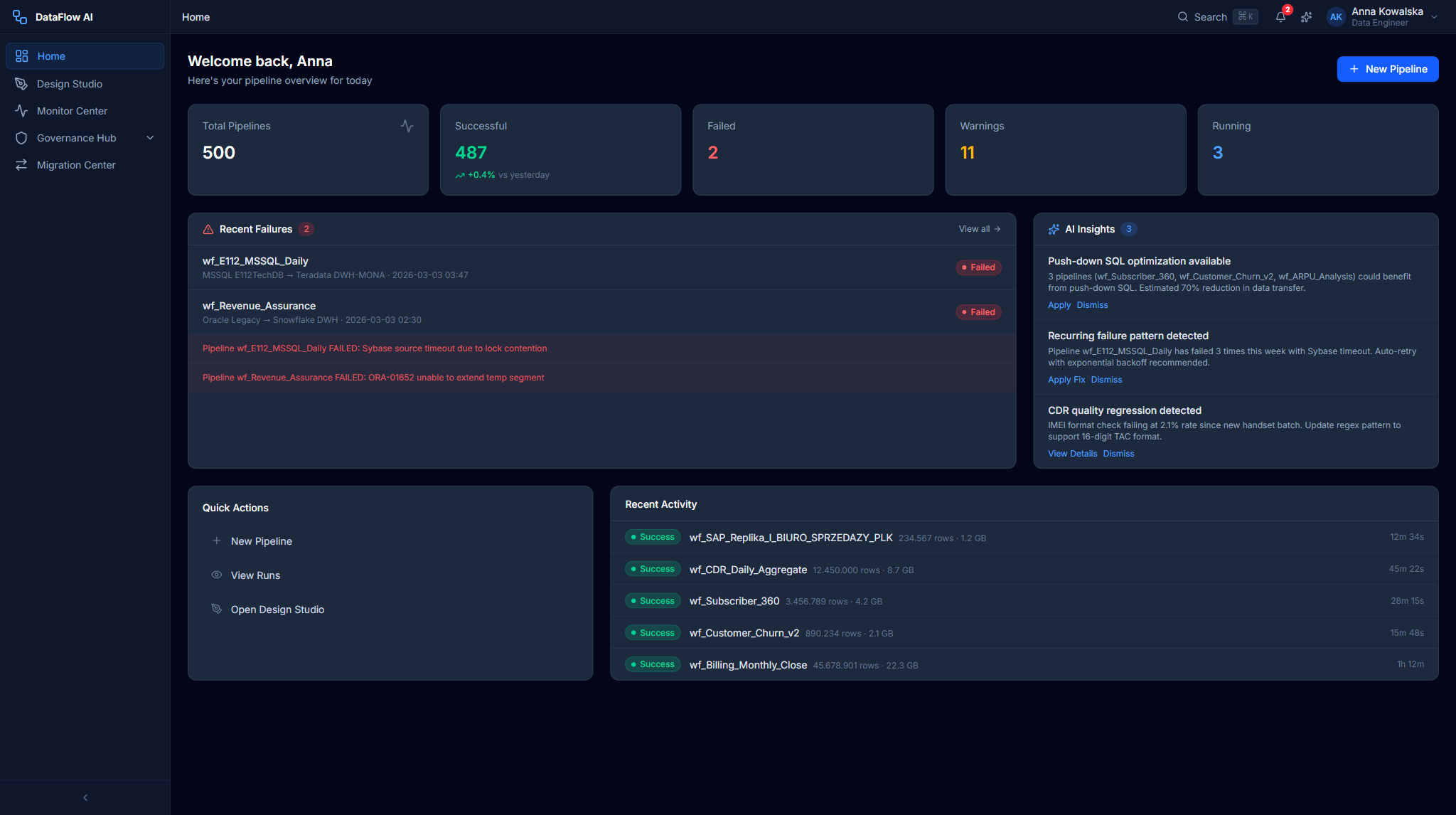
Data Engineer dashboard (Anna)
The Engineer dashboard uses a three-column grid and a blue greeting banner.
+---------------------------------------------------------------------------+
|  GREETING BANNER  "Good morning, Anna"            Tuesday, 3 Mar 2026      |
+---------------------------------------------------------------------------+
| PIPELINE STATUS CARD  | RECENT FAILURES CARD  | AI INSIGHTS CARD          |
|  487 / 500 healthy    |  wf_E112  Sybase...   |  Push-down optimization   |
|  [==green==][r][yel]  |  wf_CDR   ORA-01652   |  Schema drift  [Review]   |
+---------------------------------------------------------------------------+
| QUICK ACTIONS:  [+ New Pipeline] [Play View Runs] [Design Studio] [AI Chat]|
+---------------------------------------------------------------------------+
| RECENT ACTIVITY FEED (col-span-2)        | PIPELINE HEALTH TREND          |
|  o wf_SAP_Replika completed (2.3m)       |  7-day success-rate line chart |
|  o wf_E112 FAILED                        |  Avg: 97.4%   Trend: +0.3%     |
+---------------------------------------------------------------------------+
Key widgets
| Widget | What it shows | Click target |
|---|---|---|
PipelineStatusCard | "487 / 500 healthy" with a segmented green/red/yellow bar and legend | Navigates to /monitor |
RecentFailuresCard | Clickable failure items with error snippets and timestamps | Each item → /monitor/runs/{runId} |
AIInsightsCard | Lightbulb insights (optimization, schema drift, scheduling) with a count badge | "Review" → AI Copilot with the insight prefilled |
RecentActivityFeed | Status-dot timeline of runs and deployments | Item → run detail |
PipelineHealthTrend | A 7-day Recharts line chart of success rate | — |
Behind the scenes
The Engineer dashboard pulls from api/pipelines (listPipelines, getPipelineRuns) and api/monitoring (getDashboardMetrics, getAlerts).
Business Analyst dashboard (Marek)
A two-column grid with an emerald greeting banner, focused on the analyst's own pipelines and self-service data access.
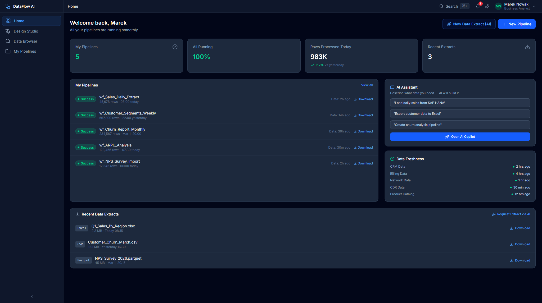
+---------------------------------------------------------------------------+
|  GREETING BANNER  "All 5 of your pipelines ran successfully."             |
+---------------------------------------------------------------------------+
| MY PIPELINES CARD  5/5         | AI CHAT QUICK ENTRY                      |
|  o wf_Sales_Daily_Extract      |  [ Ask me anything about your data... ]  |
|  o wf_Customer_Churn_Report    |  pills: Export CRM | Churn trends | ...   |
+---------------------------------------------------------------------------+
| DATA FRESHNESS CARD            | RECENT EXTRACTS CARD                     |
|  CRM   [==green==] 23 min ago  |  Q1 Revenue by Region  Excel  [Download] |
|  CDR   [==yellow=] 3 hrs ago   |  Subscriber List       CSV    [Download] |
+---------------------------------------------------------------------------+
| SCHEDULED PIPELINES TABLE (full width)                                    |
+---------------------------------------------------------------------------+
| Widget | What it shows |
|---|---|
MyPipelinesCard | The analyst's pipelines with a "5/5" badge plus last-run and next-run rows |
AIChatQuickEntry | A free-text box plus quick-prompt pills that open AI Copilot at /ai-copilot?q= |
DataFreshnessCard | Per-source freshness bars (CRM, Billing, Network, CDR, Product Catalog) |
RecentExtractsCard | Recent Excel / CSV / Parquet downloads |
ScheduledPipelinesTable | A schedule/last-run/status/next-run table |
Behind the scenes: api/dataProducts and api/gdpr (DSAR list).
Platform Admin dashboard (Katarzyna)
A three-column grid with a purple banner, oriented around platform operations.
+---------------------------------------------------------------------------+
|  GREETING BANNER  "All systems operational. 47 active users today."       |
+---------------------------------------------------------------------------+
| SYSTEM HEALTH      | COST TRACKER          | ACTIVE USERS                  |
|  CPU 34%  Mem 52%  |  Today $142           |   47 users today              |
|  Uptime 99.97%     |  Month $3,847 (77%)   |   Engineers 23 | Analysts 14  |
+---------------------------------------------------------------------------+
| INFRASTRUCTURE ALERTS (col-span-2)         | SCALING EVENTS                |
|  GKE Autoscaler 8->14 pods   [Acknowledge] |  GKE Pods 8 -> 14             |
+---------------------------------------------------------------------------+
| SERVICE STATUS TABLE (full width)                                         |
+---------------------------------------------------------------------------+
| Widget | What it shows |
|---|---|
SystemHealthCard | CPU / Memory / Disk / Network bars and uptime, with an operational/degraded/outage banner |
CostTrackerCard | Today / month / budget figures, a % bar, and a month-end forecast |
ActiveUsersCard | Total active users plus a per-role breakdown |
InfrastructureAlertsCard | Severity-coded alerts with [Acknowledge] buttons |
ScalingEventsCard | Recent autoscaling scale-up / scale-down events |
ServiceStatusTable | Per-service health rows |
Behind the scenes: api/admin (listUsers, listWorkspaces, getAuditLogs) and api/monitoring (fetchCostSummary, fetchCostAnomalies).
Data Steward dashboard (Tomasz)
An amber-banner dashboard for governance work: a review queue, quality scores, and lineage entry points. The Steward dashboard uses a three-column grid for its top row and a two-column grid for the second row.
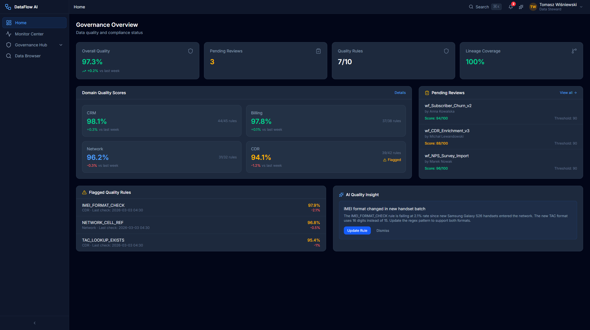
+---------------------------------------------------------------------------+
|  GREETING BANNER  "Quality score is 97.3% (+0.2%). 3 reviews pending."    |
+---------------------------------------------------------------------------+
| OVERALL QUALITY SCORE | QUALITY BY DOMAIN   | PENDING REVIEWS         (3) |
|  97.3%  (ring +0.2%)  |  CRM 98.1% Bill 97.8|  wf_Subscriber_Churn_v2    |
|  1,847 / 1,900 pass   |  Net 97.2% CDR 94.1%|  Score 94/100   [Review]   |
+---------------------------------------------------------------------------+
| LINEAGE ALERTS                             | RECENT AUDIT EVENTS         |
+---------------------------------------------------------------------------+
| QUALITY TREND CHART (full width)                                          |
+---------------------------------------------------------------------------+
Key widgets
| Widget | What it shows |
|---|---|
OverallQualityCard | A headline quality score (e.g. 97.3%) inside a circular progress ring, a week-over-week trend, and a passing / failing / disabled rule breakdown — ring color goes emerald ≥95%, amber 90–95%, red <90% |
DomainQualityCard | Per-domain quality bars for CRM, Billing, Network, and CDR, each with a score and a colored trend delta |
PendingReviewsCard | The governance review queue — pipeline name, governance score, submitter, and a [Review] button per item, with a count badge |
LineageAlertsCard | Schema-drift and broken-lineage alerts that need a steward's attention |
RecentAuditEventsCard | The latest entries from the hash-chained audit trail |
QualityTrendChart | A full-width trend line of the overall quality score over time |
A failing or low-trend domain (CDR at 94.1%, −1.2% in the mock data) draws the eye first — exactly the dataset a steward should investigate. Clicking any domain bar opens /governance/quality/{domainId}; clicking a review opens /governance/reviews/{id}.
Behind the scenes: api/governance (listReviews) and api/gdpr (overdue DSARs).
First-run onboarding
A brand-new user does not land cold on the dashboard. The first sign-in triggers the Onboarding wizard (/onboarding) — a guided six-step first-run experience — and a dismissible tour overlay highlights the dashboard zones in place.
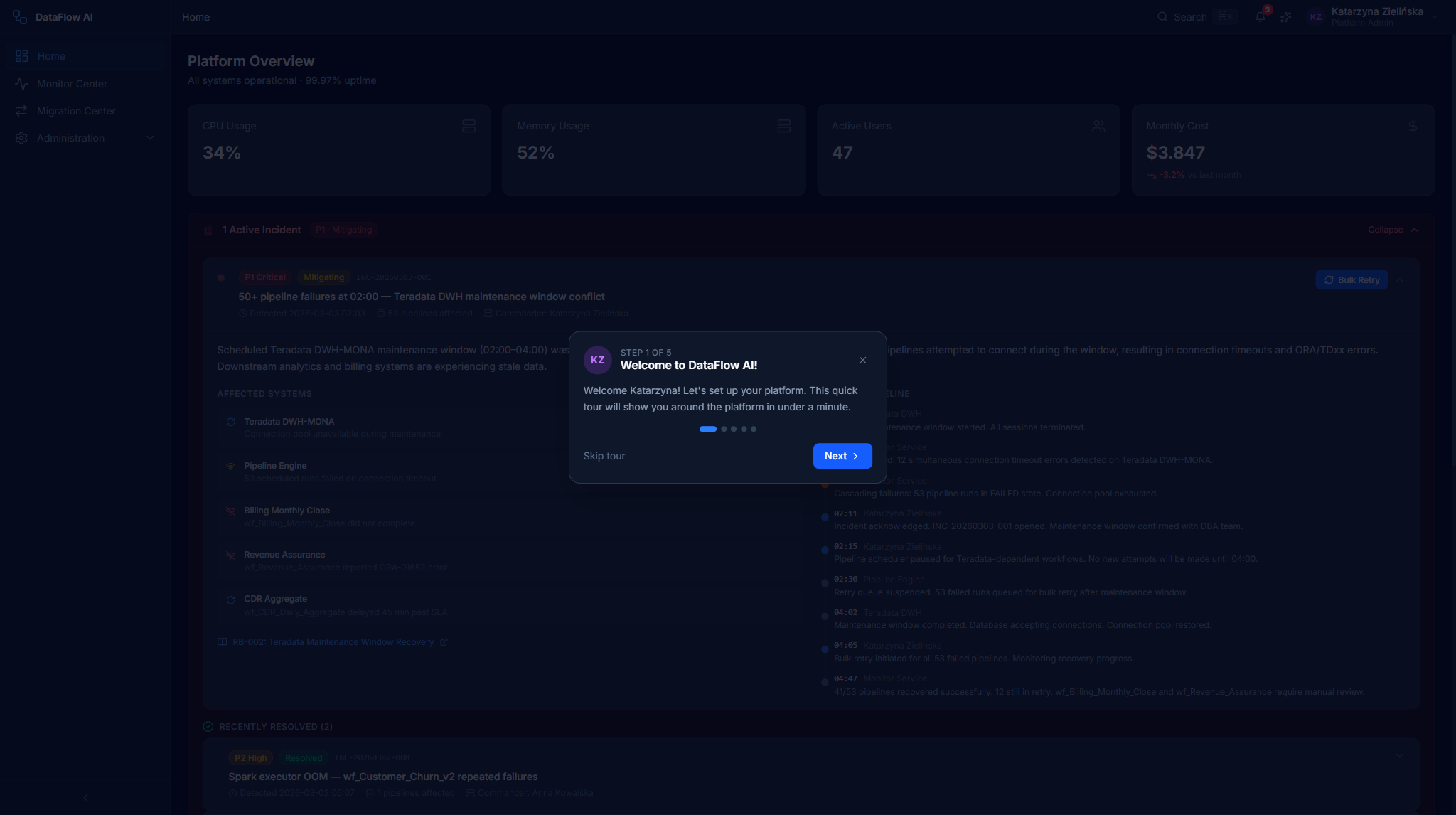
The tour is persona-aware: it points at the widgets that matter to the active role and skips modules that role never sees. Once dismissed or completed, the tour does not re-appear; you can re-launch it later from Help & Docs in the sidebar footer.
Click-paths
Triage a pipeline failure (Engineer)
- Sign in — you land on
/dashboard. - Locate the
RecentFailuresCardin the top row. - Read the error snippet and timestamp on each failure item.
- Click a failure item — the platform navigates to
/monitor/runs/{runId}. - On the Run Detail page, read the AI Diagnosis panel to get the root cause.
Start building a new pipeline
- From the dashboard, find the Quick Actions bar.
- Click New Pipeline.
- The platform navigates to the Design Studio (
/design-studio) with a blank canvas.
Acknowledge an infrastructure alert (Admin)
- On the Admin dashboard, find the
InfrastructureAlertsCard. - Identify an alert that still shows an
[Acknowledge]button (unacknowledged alerts only). - Click
[Acknowledge]. - The alert is marked acknowledged and the button disappears from that row.
Ask the AI about your data (Analyst)
- On the Analyst dashboard, find the
AIChatQuickEntrycard. - Either type a question into the free-text box and press Enter, or click a quick-prompt pill such as Show me subscriber churn trends.
- The AI Copilot opens at
/ai-copilot?q=...with your prompt prefilled and ready to send.
Open one of your scheduled pipelines (Analyst)
- Scroll to the
ScheduledPipelinesTableat the bottom of the dashboard. - Scan the Status column for any non-green dot.
- Click the pipeline row to drill into its detail view.
One slow panel won't break the page
Because each panel is error-isolated and KPI calls use useRetry, a temporary backend hiccup shows a localized retry control on that panel only. Refresh the panel rather than the whole page if a single tile fails to load.
Common questions
Why does my dashboard look different from a colleague's? The dashboard is role-adaptive. A Data Engineer, a Business Analyst, a Platform Admin, and a Data Steward each see a layout built around their job. If two people in the same role see different data, it is usually because they are in different workspaces.
What is a "persona" and can I change mine? A persona is the role the platform treats you as. In a normal session it comes from your corporate login (Keycloak) and is set by an administrator. It decides which dashboard and which sidebar items you see. To change your real role, contact your workspace administrator.
One of my dashboard tiles shows an error — is the platform down? Almost certainly not. Each panel loads its data independently, so a single tile failing usually means one brief backend hiccup. Click the retry control on that one panel; you do not need to reload the whole page.
What do the colored numbers in the KPI tiles mean? They are live counts pulled straight from the platform. Green generally means healthy, red means something needs attention. Each tile is clickable and takes you to the screen where you can act on it.
I just signed in for the first time and a wizard appeared — what is it? That is the Onboarding wizard, a guided six-step first-run setup. It helps you pick your persona, name a workspace, create a first connection, and take a short tour. You can skip most steps. Once finished it does not reappear, but you can re-launch the tour from Help & Docs in the sidebar.
How do I get to the AI assistant from here? Click the sparkle button at the bottom-right of any screen, or — on the Analyst dashboard — type a question into the AI Chat Quick Entry box. Either way the AI Copilot opens with your question ready to send.
How often does the dashboard refresh? KPI tiles fetch live data on load and retry automatically on a transient failure. For continuously updating run status, the Monitor Center is the screen built for real-time tracking.
API summary
| Persona | Primary API modules |
|---|---|
| Engineer | api/pipelines, api/monitoring |
| Analyst | api/dataProducts, api/gdpr |
| Admin | api/admin, api/monitoring |
| Steward | api/governance, api/gdpr |
All calls go through the shared Axios client (api/client.ts), which injects the Keycloak bearer token, adds a CSRF token on mutating requests, and converts snake_case responses to camelCase automatically.